Overview
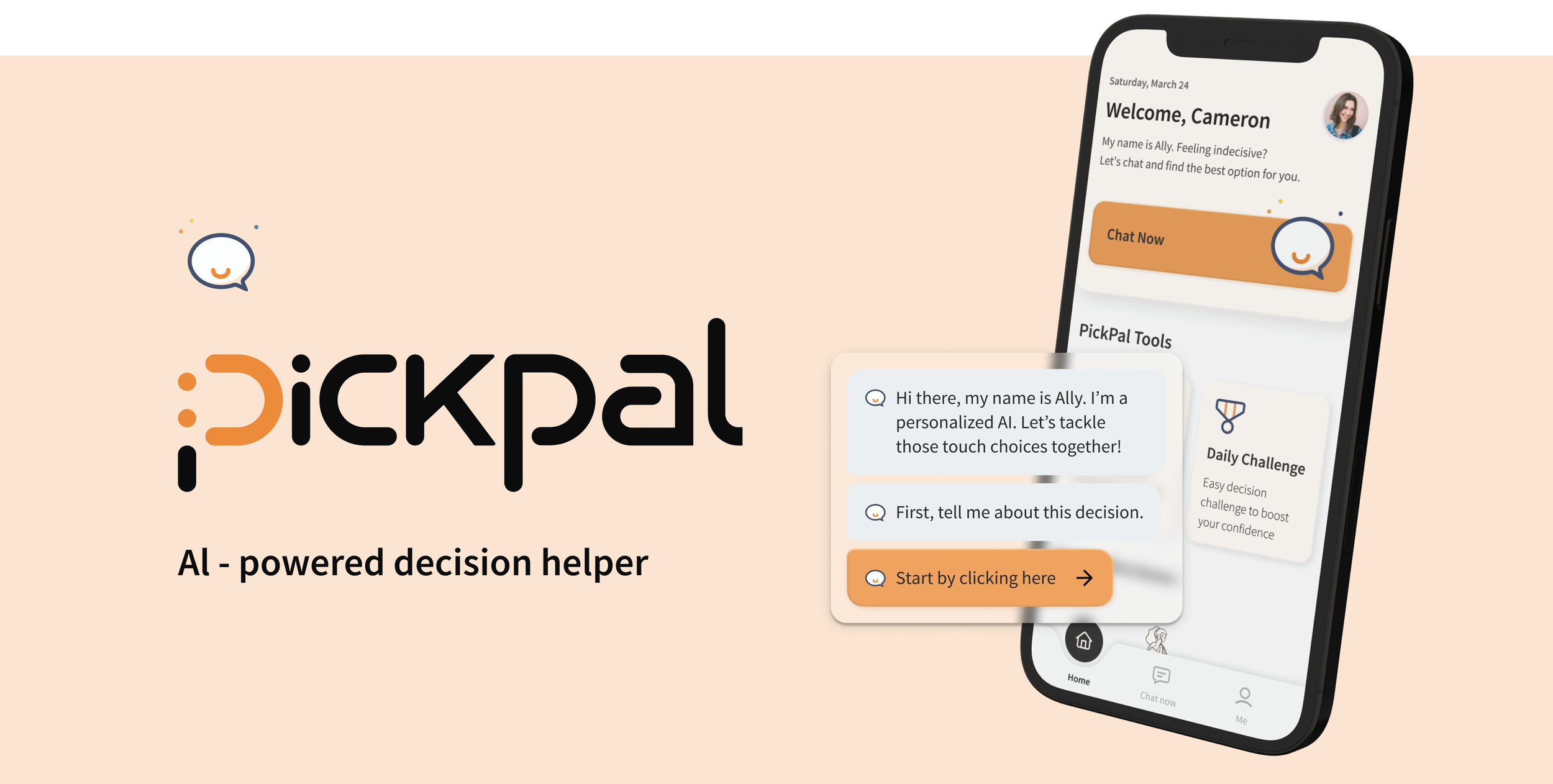
PickPal is an AI-powered chatbot that is a reliable ‘Ally’ in decision-making. It's designed to streamline the process by offering personalized guidance and insights. Users input their options and reasoning, and PickPal provides tailored analysis to help weigh the pros and cons effectively.
By empowering users to make informed decisions, PickPal aims to simplify complex decisions into manageable steps. Ultimately, Pickpal addressed the concerns across fear and avoidance that led to decision fatigue and ensured our user felt empowered and in control of their decision-making journey.
Role
UI/UX Designer
8 Weeks
Tools
Timeline
Figma

Dovetail
User Research, Wireframing, Interaction design, Prototyping, Usability testing
Problem
Indecisiveness and decision-fatigue are commonly seen behavioral patterns among the young generation…
As the young generation transitions into a new phase of their lives, they are confronted with an overwhelming number of decisions, regardless of their significance. From selecting a career path and navigating educational opportunities to making financial choices and managing relationships, the volume and complexity of decisions can be daunting.
Indecisiveness among the young generation can lead to significant consequences, including missed opportunities, delayed progress, increased stress, and anxiety. It's crucial to acknowledge the importance and severity of indecisiveness, as well as the lack of support in the community, as it can hinder personal growth and impact their mental well-being.
Secondary research
How severe is this problem? Numbers give us a clear idea…
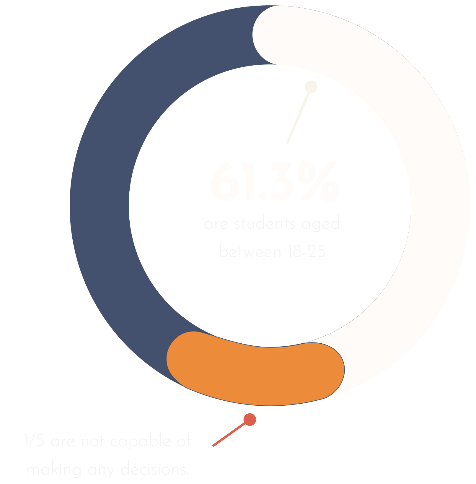
In the US, over 20% of adults suffer from procrastination and decision fatigue, which gives them hard times during the decision-making process.
Among all of these procrastinators, 61.3% of the population are students below the age of 25. About 1/5 of these young adults struggle to make any decisions, reflecting a form of psychological vulnerability
Despite the growing recognition of the importance of mental well-being, there remains a noticeable gap in both the market and the community regarding providing practical support for decision-making processes among young generations. The lack of accessible and straightforward decision-making methods amplifies the challenges young people face, leaving them without the necessary tools and resources to navigate life's choices effectively.

Primary research
We need to get to know our users first.
To better understand our target audience's pain points, behaviors, and motivations in interacting with day-to-day decision-making, 3 interviews were conducted.
The interviewees have to meet the following criteria: aged between 18-25, have experienced difficulty during the decision-making process, and consider themselves procrastinators.
Result synthesis
The backbone of the project.
Interview data were put together and categorized into pain points, behaviors, and motivations to further format into an affinity map.
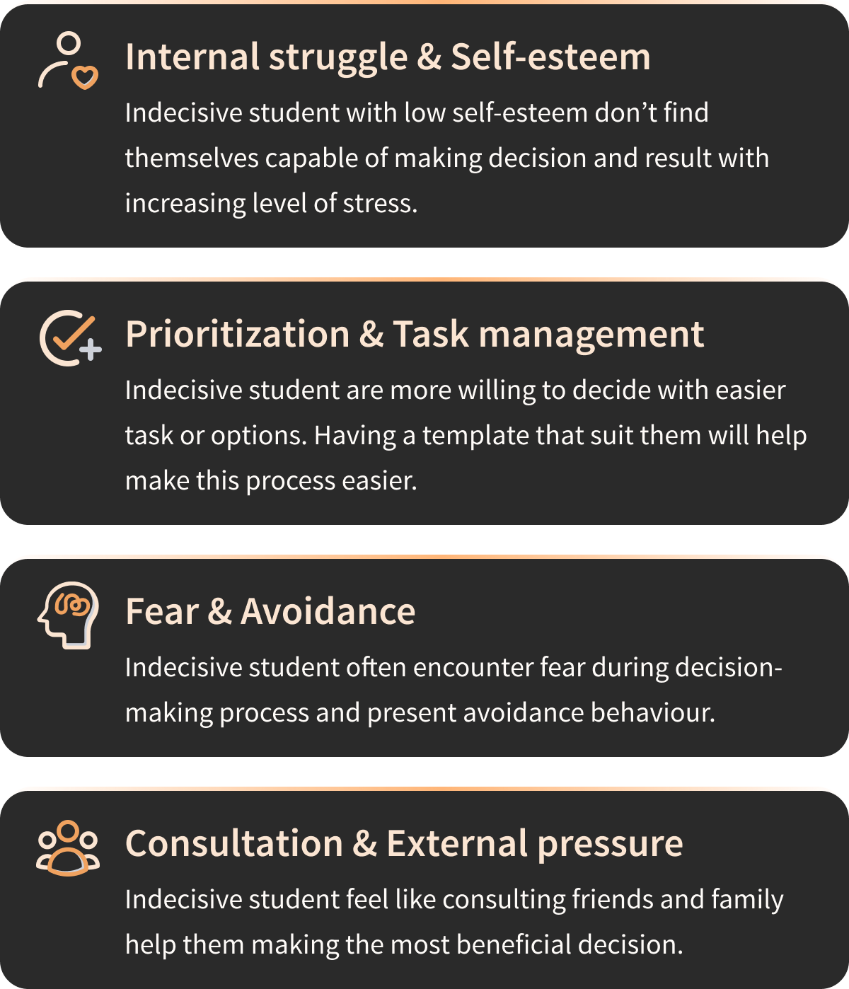
From there, patterns and themes were grouped that represent an aspect of the problem space.
These themes include:
This is not a one-and-for-all solution…
Knowing the fact that any solution is not one-and-for-all, focusing on a specific group of people and a theme allows for a targeted solution that for sure helps our potential users before generalizing to solve the overarching bigger problem is the way to go. Therefore, the theme that had the most pain points will be the main focus of this project.
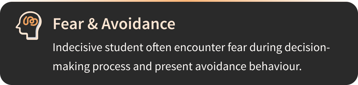
Among all themes, Fear & Avoidance had the most outstanding number of interviewee pain points.
Refine and Define
Real people communicate empathy.
To effectively communicate the design principle from the perspective of users, an imaginary persona named Cameron was crafted based on the gathered and refined interview data. Cameron embodies the frustrations and challenges shared by interviewees, particularly in navigating day-to-day decisions, especially the more difficult ones. As a young graduate transitioning into a new stage of her life, she is afraid to make decisions promptly due to the fear of making the ‘wrong' decision and most often procrastinates until it’s too late. Therefore she wants to feel more confident and in control of her post-graduation plans.

Seek opportunities from current experience.
Drawing from Cameron’s frustration and behavioral patterns, a current state experience map was crafted to illustrate her decision-making process regarding post-graduation plans. This map serves as a visual representation of Cameron’s journey, and by capturing Cameron’s current low-point feelings, opportunities for improvements were also identified.

The Challenge
How might we encourage students to overcome fear and avoidance in decision-making in order to reduce procrastination and decision fatigue?
Functionality & Action
How can we help effectively?
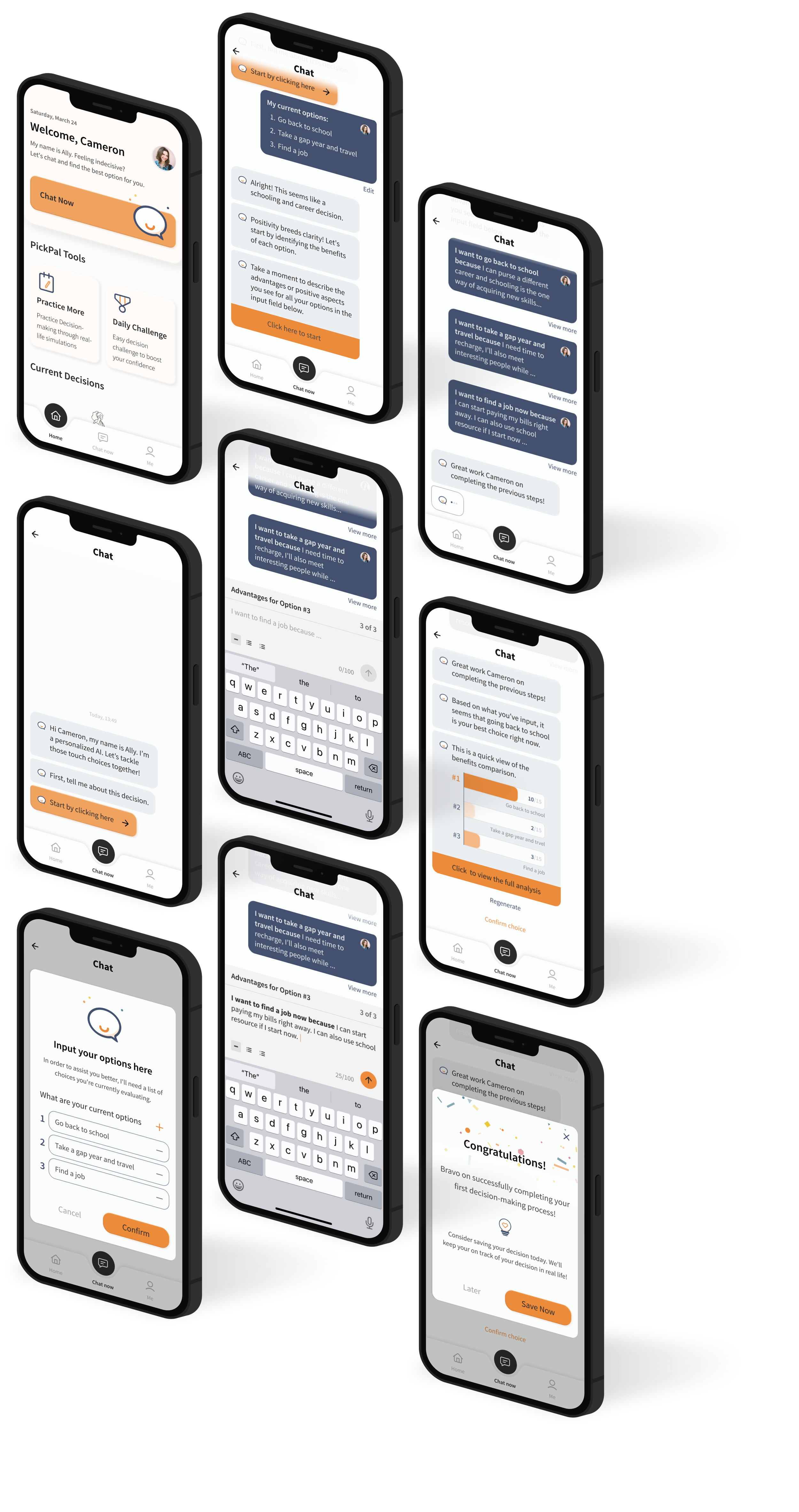
During this phase of the design process, the target audience's demographic and specific needs were prioritized, ensuring the development of truly user-centric designs. Over 30 user stories were crafted and organized into three distinct epics, each embodying unique functionality. Among these, the selected user stories fall within the core epic, focusing on providing real-time feedback and support during decision-making.
I want to input my options/scenarios , so that I can receive prompts that lead to possible solutions.
I want to input my reasoning for each option, so that I can be more informed on each option I have right now.
I want to receive prompts and questions that guide me through the decision-making process, so that I can break down the decision into steps and feel less stressed.
I want to know what is the recommended approach to my decision, so that I can be more assured that I’m making the correct decision.
I want to know the exact value of my options, so that I can better weigh on different options.
I want to get motivated quotes and affirmations throughout my decision-making journey, so that I can be more motivated and feel more confident to continue the process.
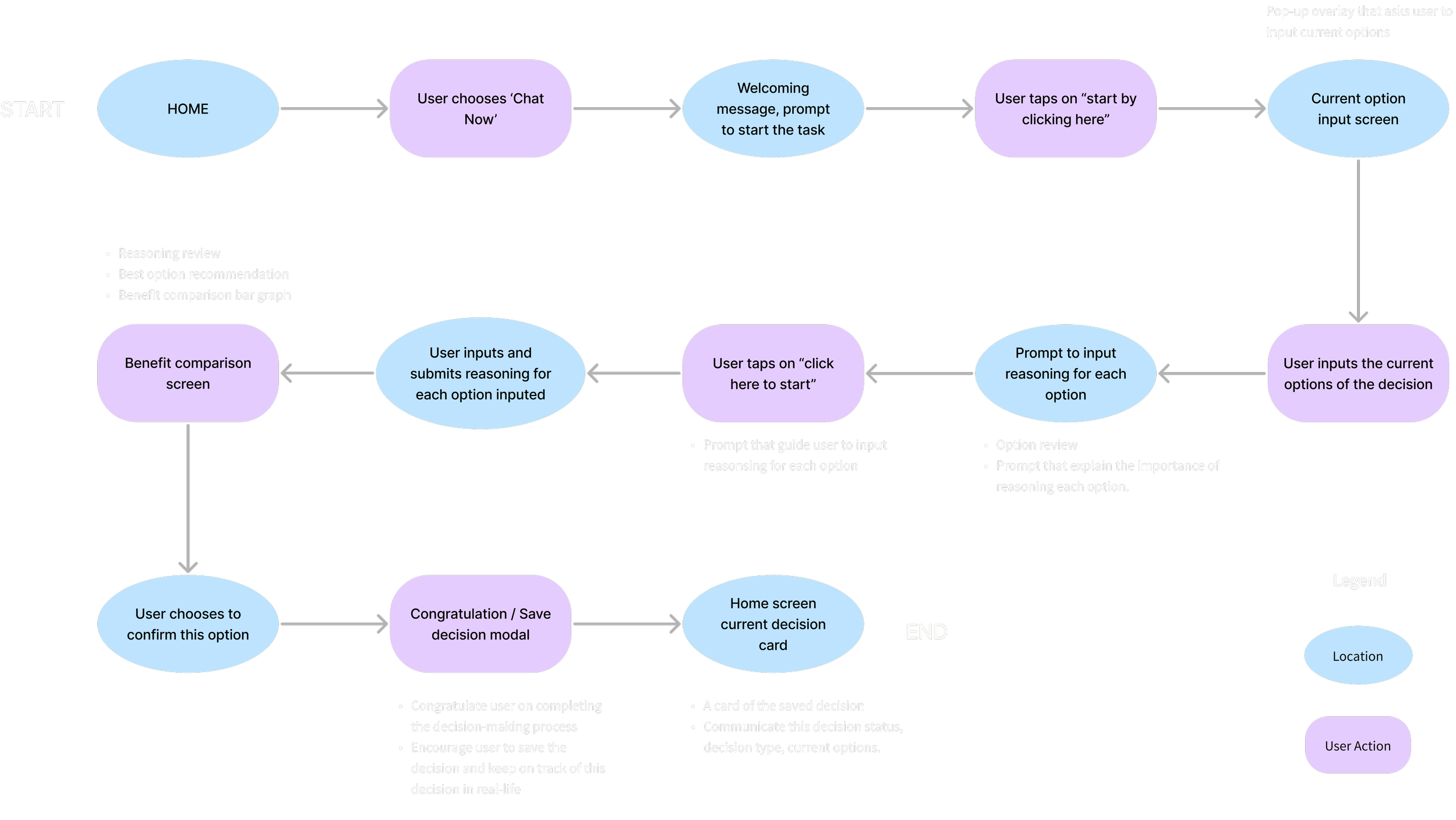
Define user action and flow of the product
Having the main functionality in mind, the primary task flow aims to provide immediate gratification and support during the decision-making process to alleviate users’ fear and avoid making the ‘wrong’ decision.
In short, the primary task flow consists of 3 main focuses: Inputting current options, Inputting reasoning for each option, and conforming and saving the decision after reviewing the recommended option.
Why not choose a traditional digital solution?
Personalization
With the rapidly developing tech environment, AI can provide more personalization and adaptive experience by analyzing user behavior and preferences in real-time.
The ability to handle complex data and processing efficiently
Compared to traditional digital solutions, AI-powered applications have the ability to analyze complete language-based data and process them efficiently. Especially in situations where the user struggles to make decisions and would appreciate immediate gratification. Additionally, AI-powered systems can continuously learn and improve over time, by learning from users’ past experiences, the system could help them make more informed decisions from their past preferences.
Ideation & Exploration
Explore possibilities before narrowing down.
Over 20 exploratory sketches were drawn based on the preliminary UI inspiration gathered. The sketch screens were created on the task flow developed earlier.
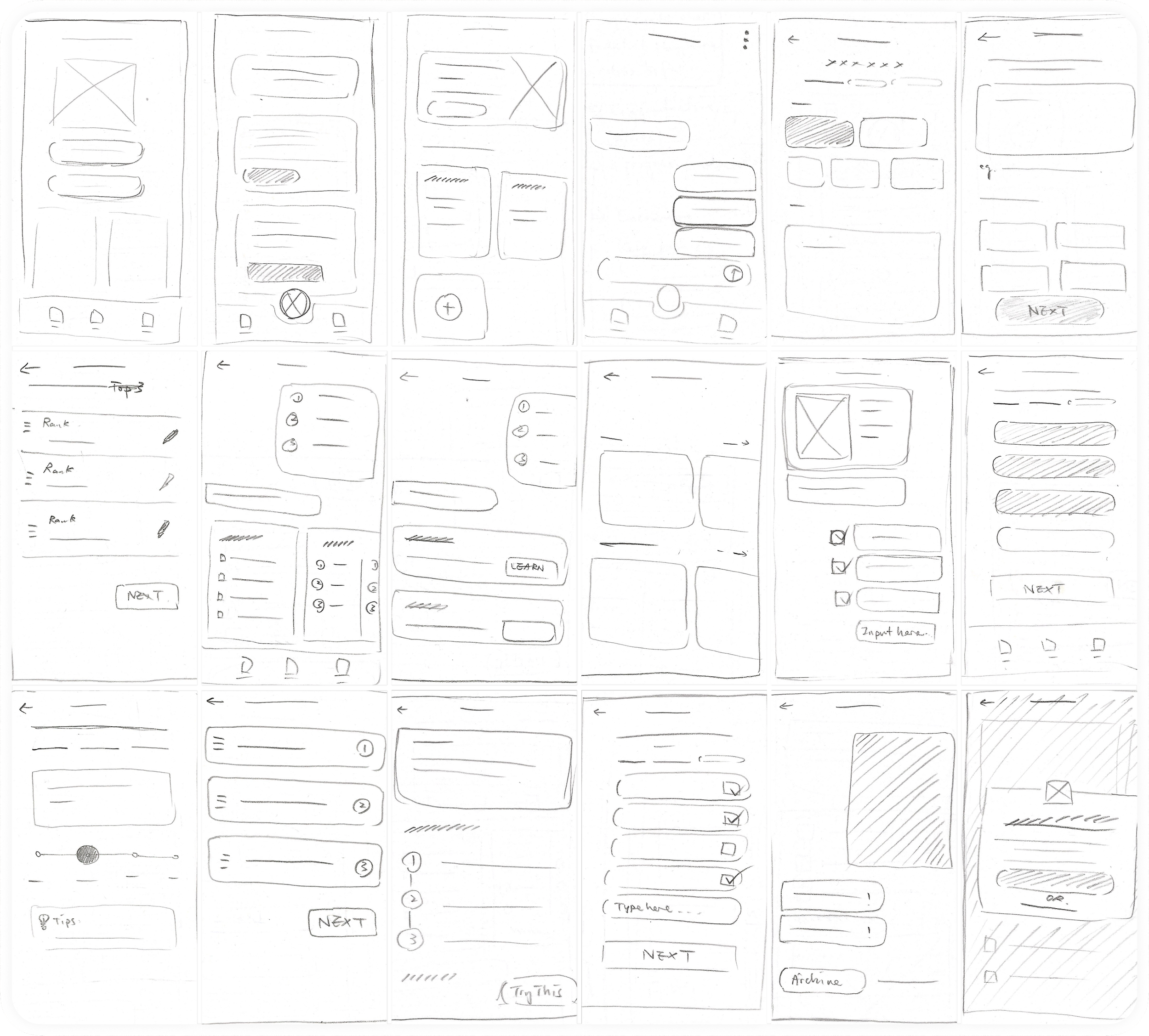
From paper to digital
Conder back to the needs and preferences of the persona, Cameron, a particular set of screens was selected to develop further into digital mid-fi wireframes in greyscale.
These screens were composed of basic animations that were considered bare minimal for usability testing.
Testing & Iteration
We improve on feedbacks
To be able to improve the usability of the product, the initial design went through 2 rounds of usability testing with 5 different participants for each round. The usability testing for each round achieved an overall 90% success rate in completing the designated tasks, but several key feedbacks and confusions were repetitively reflected in user feedback. These design iterations sought to address the key feedback to improve overall usability and accessibility. The iterations were orange by location.
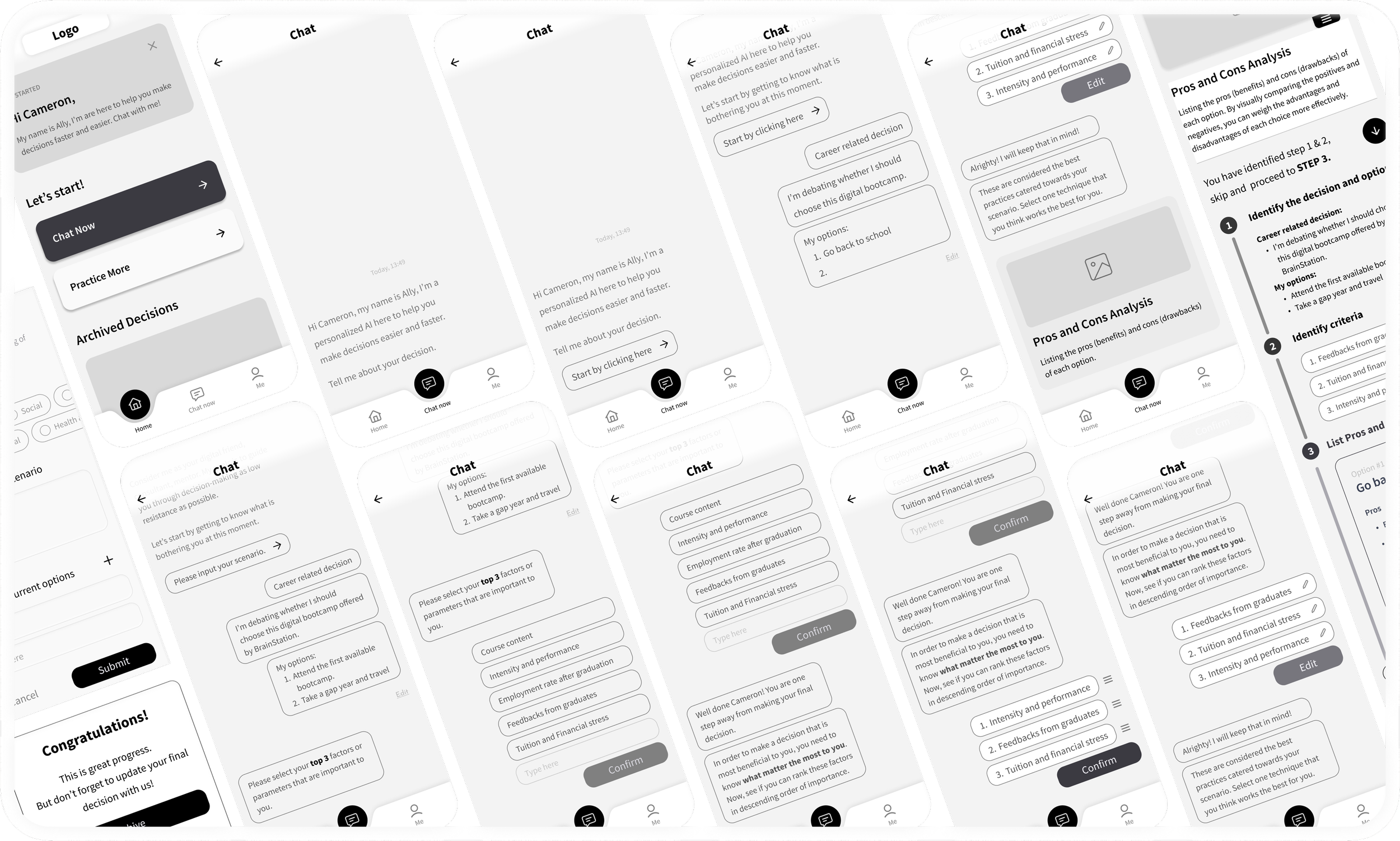
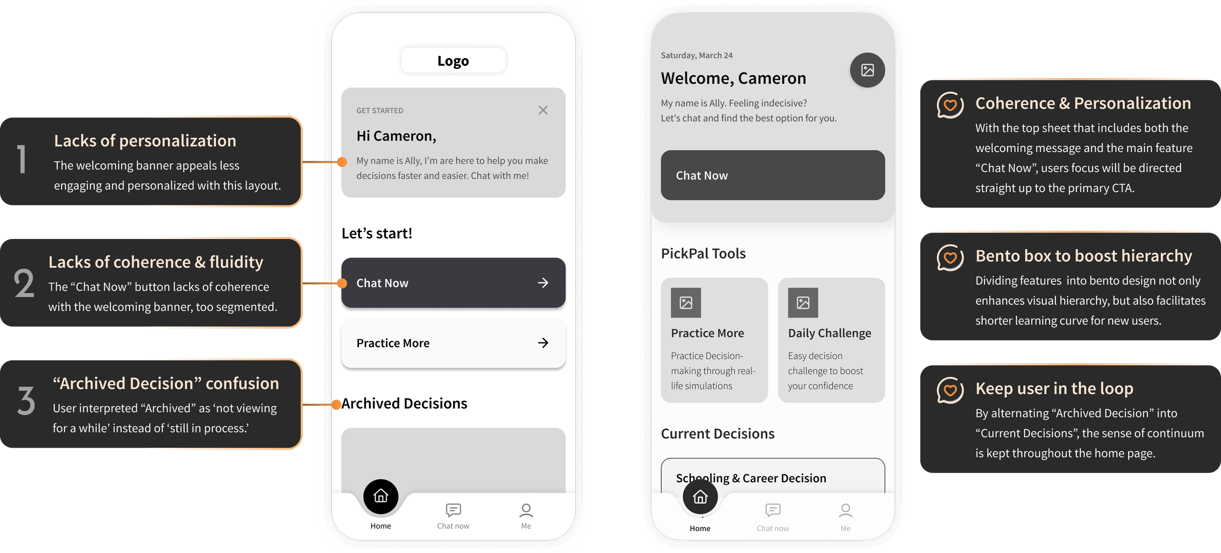
#1 Home screen: Optimal visual hierarchy and coherence
Most of the feedback mentioned the lack of visual hierarchy and personalization on the home screen. The home screen being the landing point of the user’s journey, it has to embark on the purpose of the app but also easily guide the user to initiate the primary task. The discontinuity of the contents and waterfall-style layout prolonged users’ scan time before starting their primary task. By implementing welcoming cards that include the primary “Chat Now” CTA, the user’s attention will be naturally drawn to that primary button, enhancing coherence in general. The bento box design also serves the purpose of improving visual hierarchy and scannability.
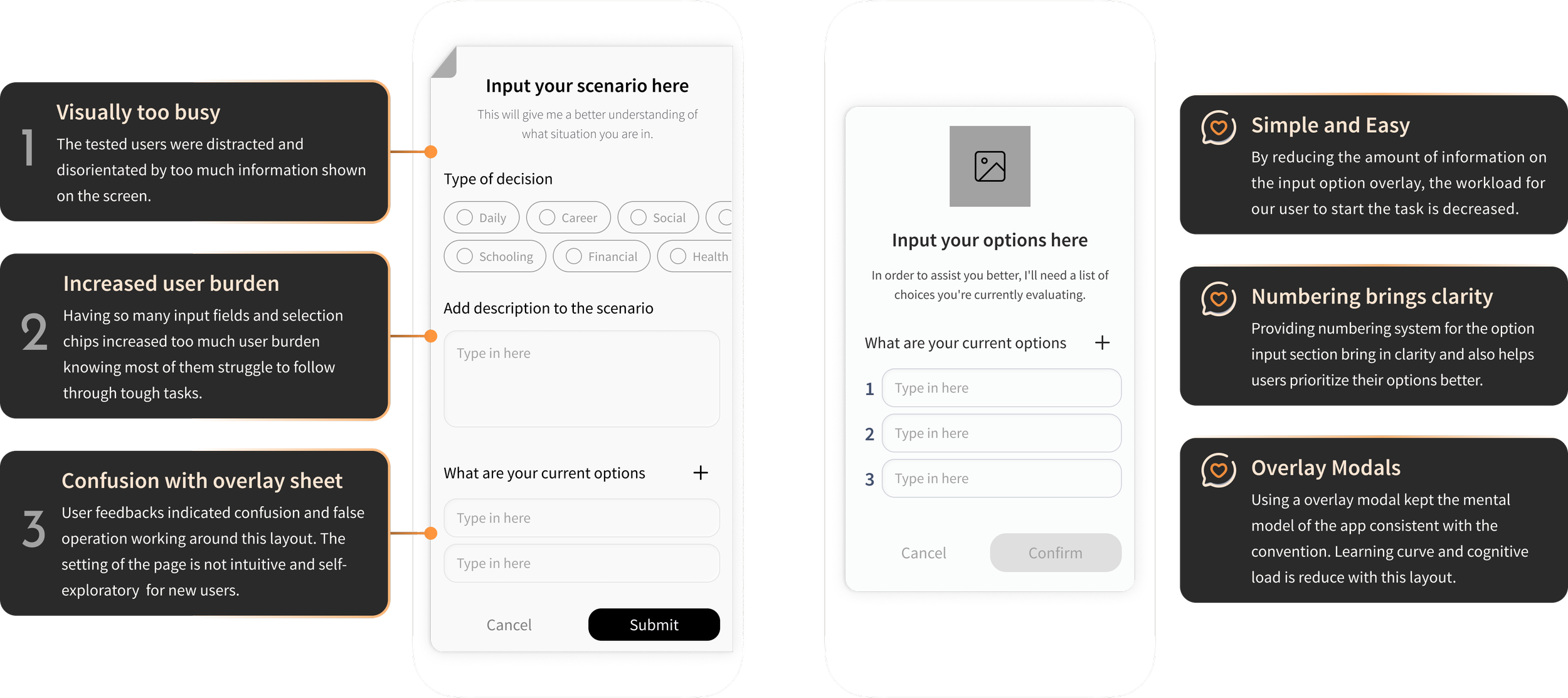
#2 Option/Scenario input overlay: Reduce user burden and minimalist design
Another common feedback highlighted the challenge of dealing with an overwhelming amount of information on the scenario input sheet. Considering the persona's struggle with indecisiveness and lack of confidence in complex decision-making, the abundance of chips and input fields only added to the user burden, making the process even more daunting. To address this, iterations were undertaken to streamline the experience by eliminating unnecessary features and minimizing the displayed information on this screen.
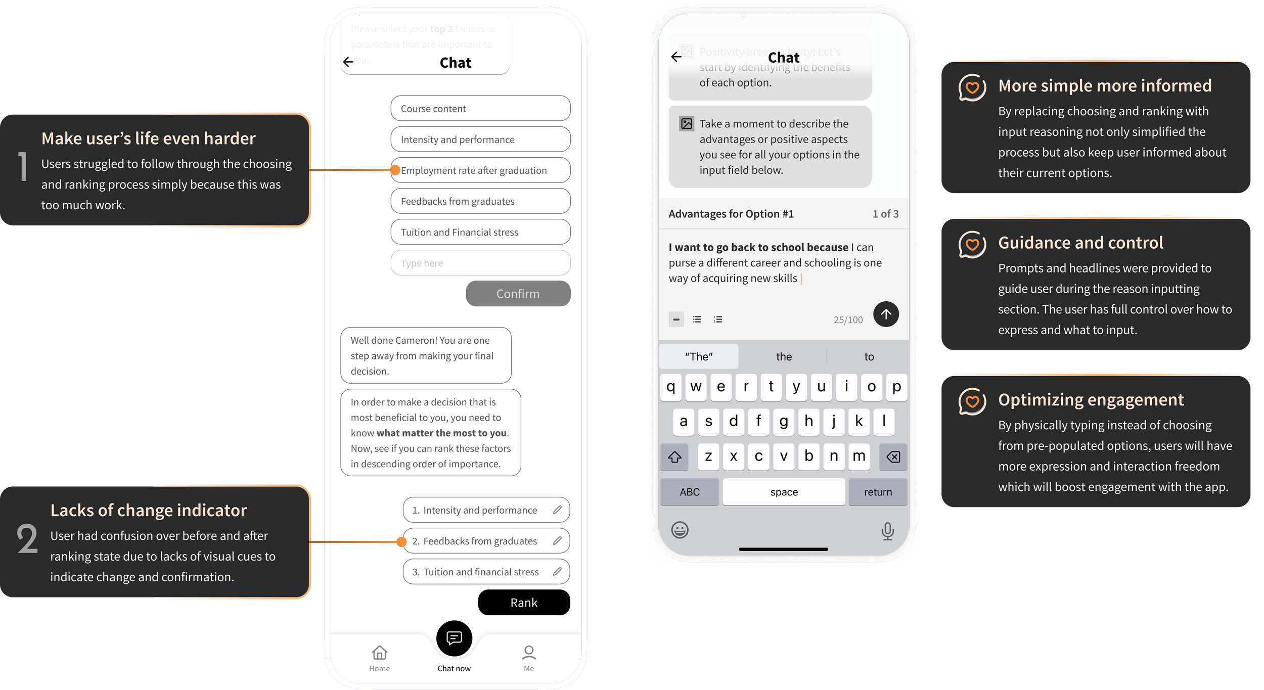
#3 Reasoning input screen
Similar feedback was noted regarding the choosing and ranking parameter screen, where users expressed feeling overwhelmed by the feature and the associated workload. This deviation from the original purpose unintentionally made the user experience more challenging. As a result, the entire flow transformed, now featuring a simpler and more intuitive element: reasoning input. With this update, users no longer need to select and rank options; instead, they are prompted to provide reasoning for each previously inputted option. This format not only grants users more control but also empowers them to reconsider the benefits of each option and provide informed reasoning, ultimately enhancing their decision-making process.
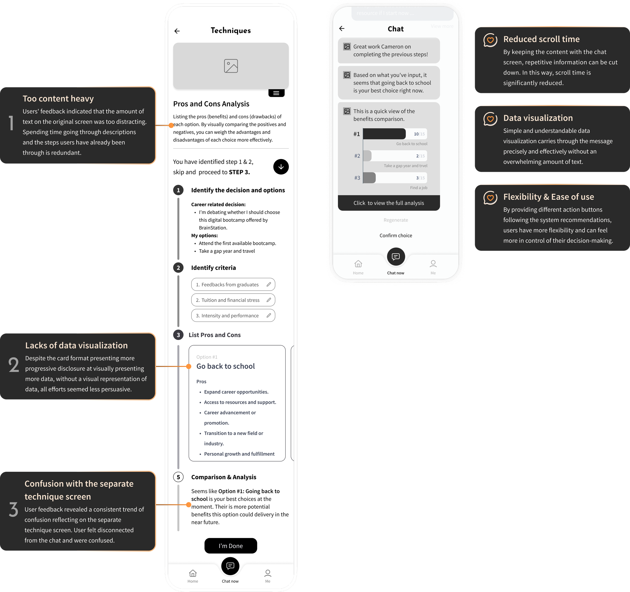
#4 Value proposition: Simpler process and digestible data visualization
Feedbacks were shared across 2 rounds of usability testing regarding the redundancy of repetitive information shown on the original techniques page. Users complained about scroll time, and also general difficulty following through the progress bar. The lack of visual representation of data also drained users’ attention. The fact that the technique screen took users away from the chat and entered into a traditional digital app-like screen confused testing participants.
Therefore, to improve the pain points gathered. Design interactions were focused on simplifying the process. The design was stripped back to the skeleton and rebuilt from scratch. Now, by keeping all recommendations within the chat screen, I was able to reduce scroll time significantly. Further implementing simple and easily digestible graphs helps users register their benefits comparison promptly.
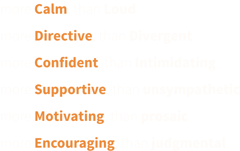
Calm
•
Directive
•
Supportive
•
Motivating
•
Encouraging
•
Calm • Directive • Supportive • Motivating • Encouraging •
Branding development
Now we put the flesh on top of the skeleton!
A list of 'More A than B' adjectives was compiled to delineate the brand identity.
These selected adjectives encapsulate the foundational character of the product and convey a powerful, empowering message to our users.
Carry the tone through visual representations…
Visual representations of the list of adjectives were put together to form a compelling moodboard.
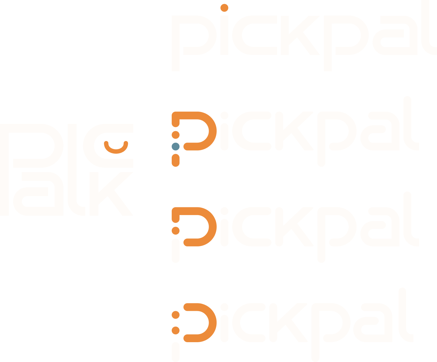
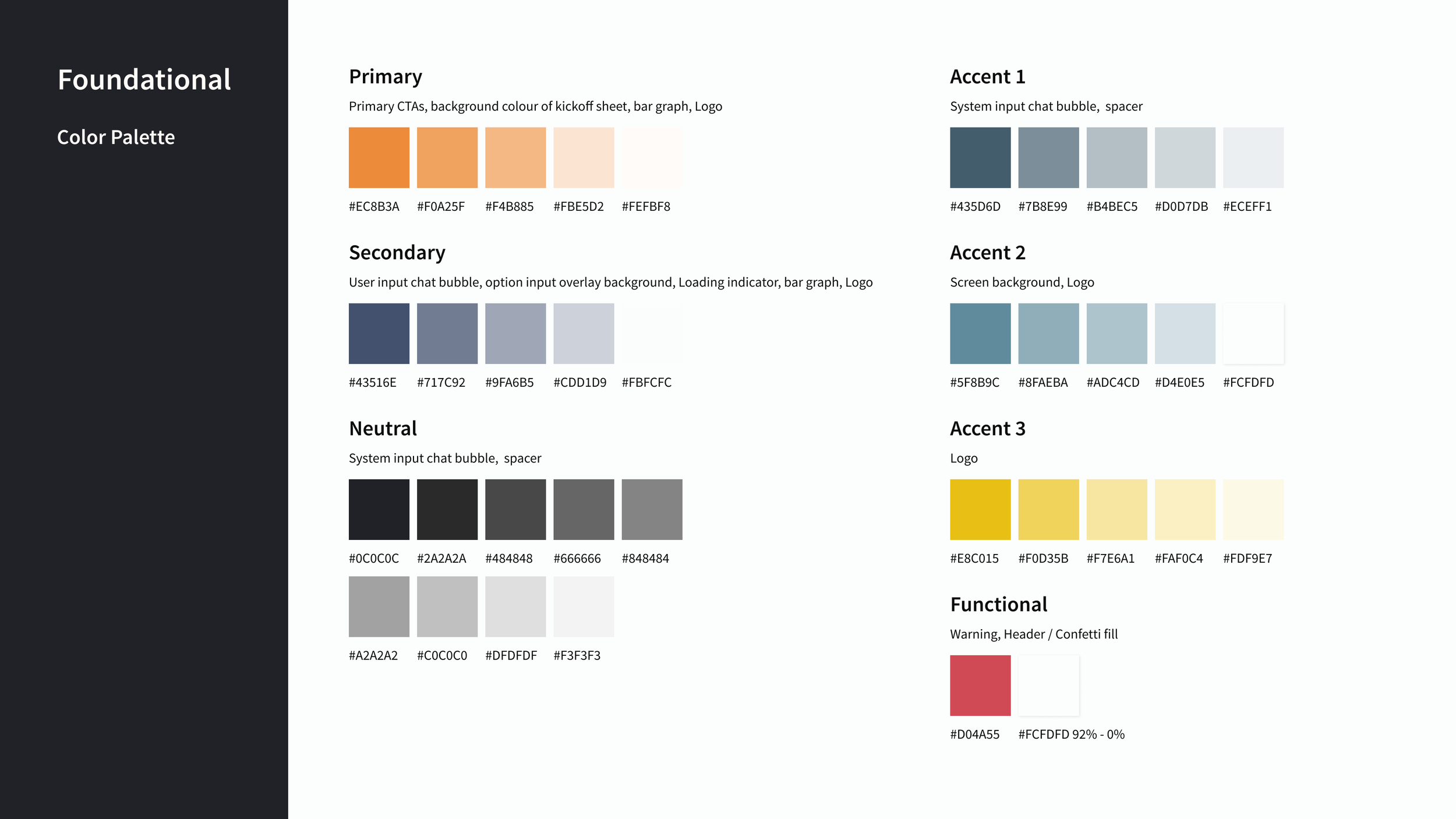
To keep a consistent tonality across product development, a primary brand color, a secondary color, and an accent color were extracted from the moodboard. These colors resonate well with the adjectives and bring across the welcoming and engaging tonality of the brand.

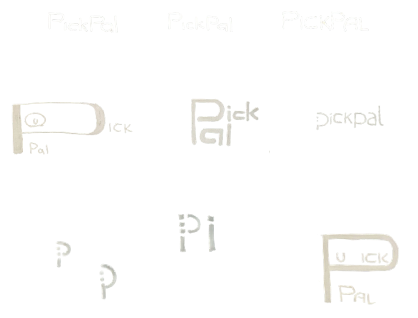
Before PickPal was PickPal…
Alongside the extraction of colors from the moldboard, wordmark exploration happened simultaneously…
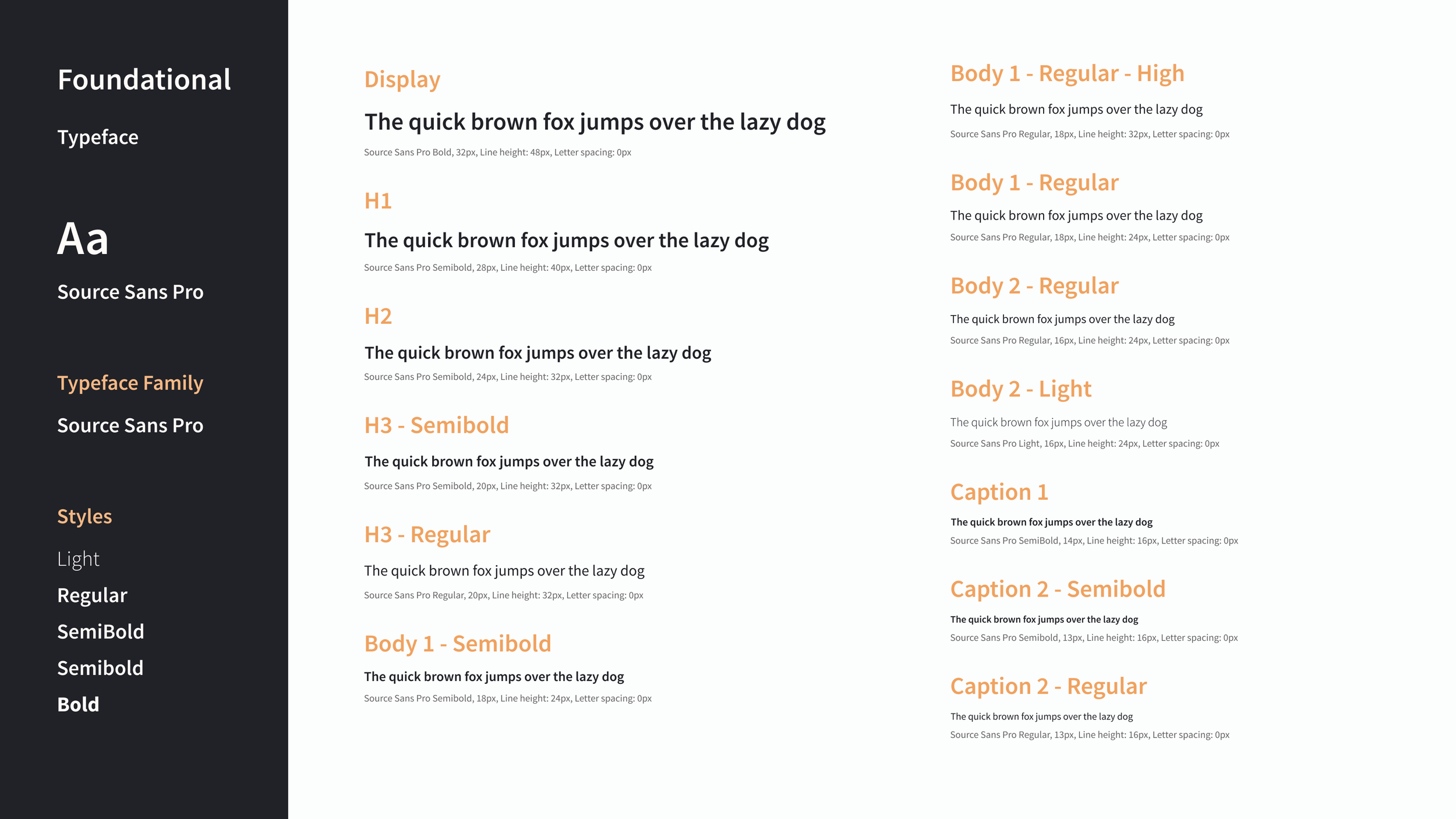
Of course, this is hand-off ready.
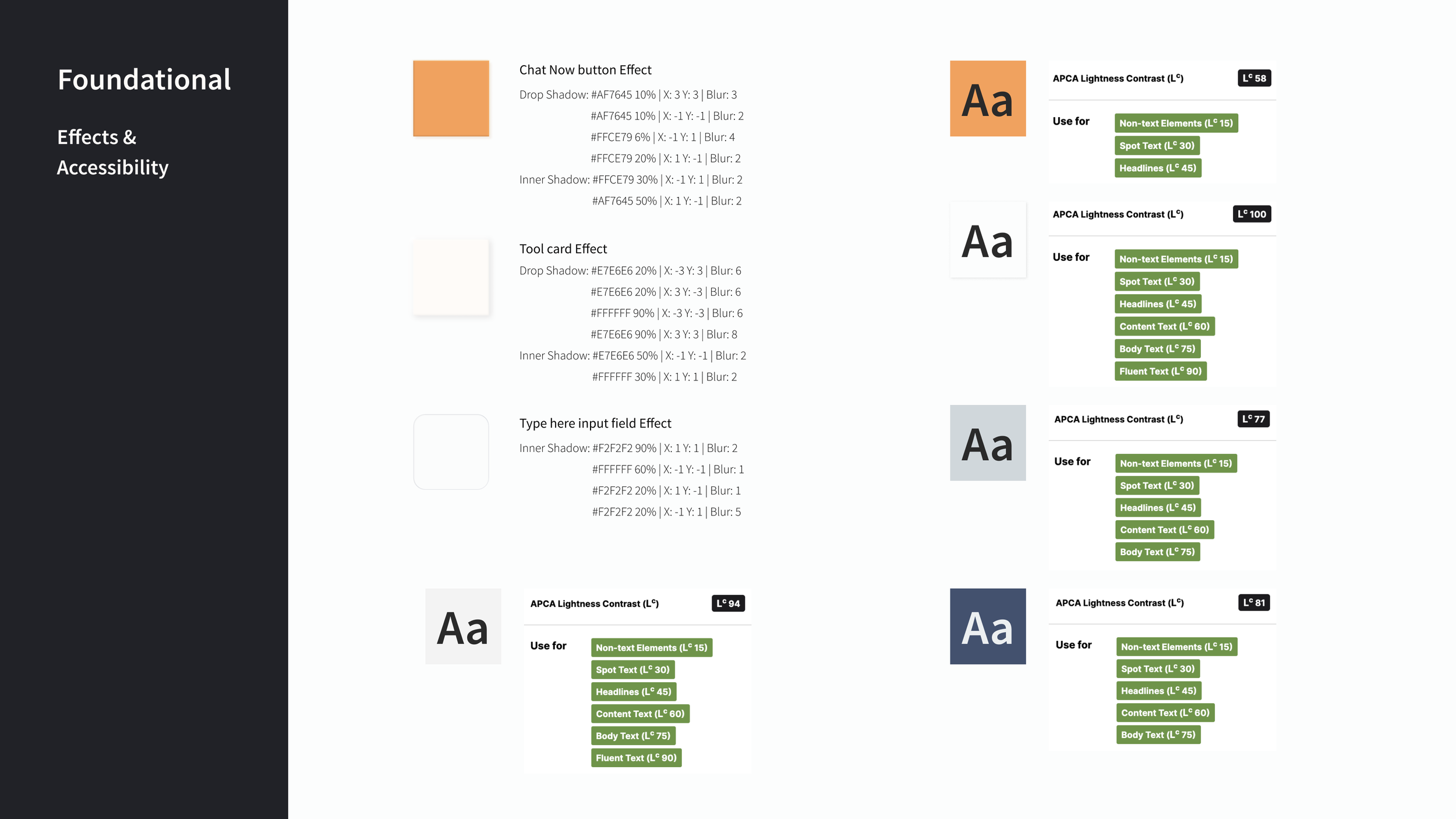
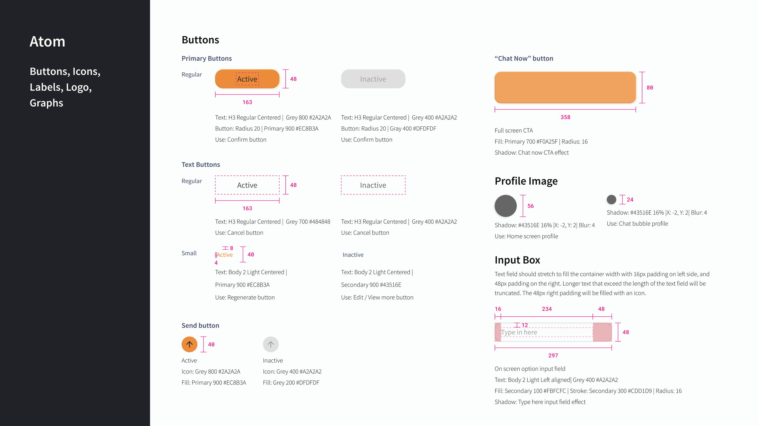
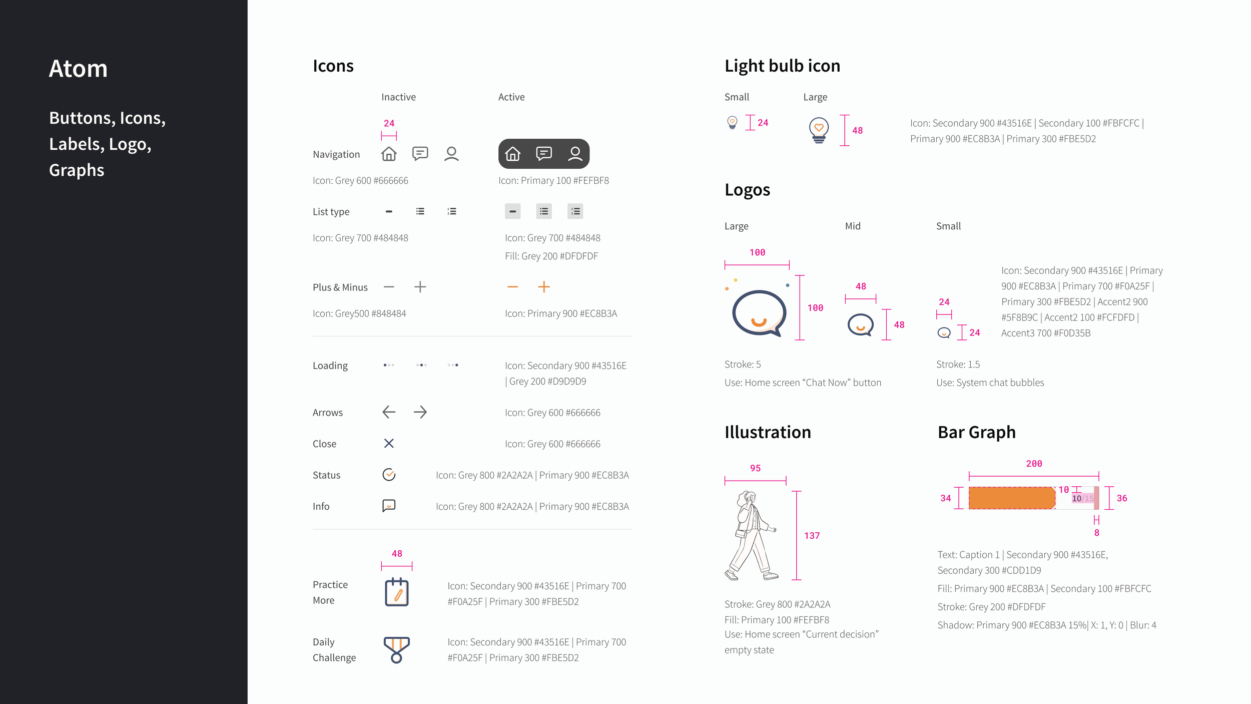
A UI library was built that consists of all the foundational elements up to the screen templates. Below is a highlight of the UI library, click through the button to view more.
And finally, the high-fi prototype!
Retrospective
Unlocking impact and potential
With PickPal, the aim was to relieve users’ stress and fear during decision-making processes. Ultimately, it breaks down large decisions into smaller, manageable steps that are easier to achieve. Essentially, the end goal is to help students make more informed decisions.
To take this project further to the next level the product aims to reach at least 95% overall user satisfaction rate. Furthermore, an AI-powered system has endless potential. By implementing machine learning effectively, an AI system could learn and improve consistency and ultimately learn from past user behavior and help them make more informed decisions.
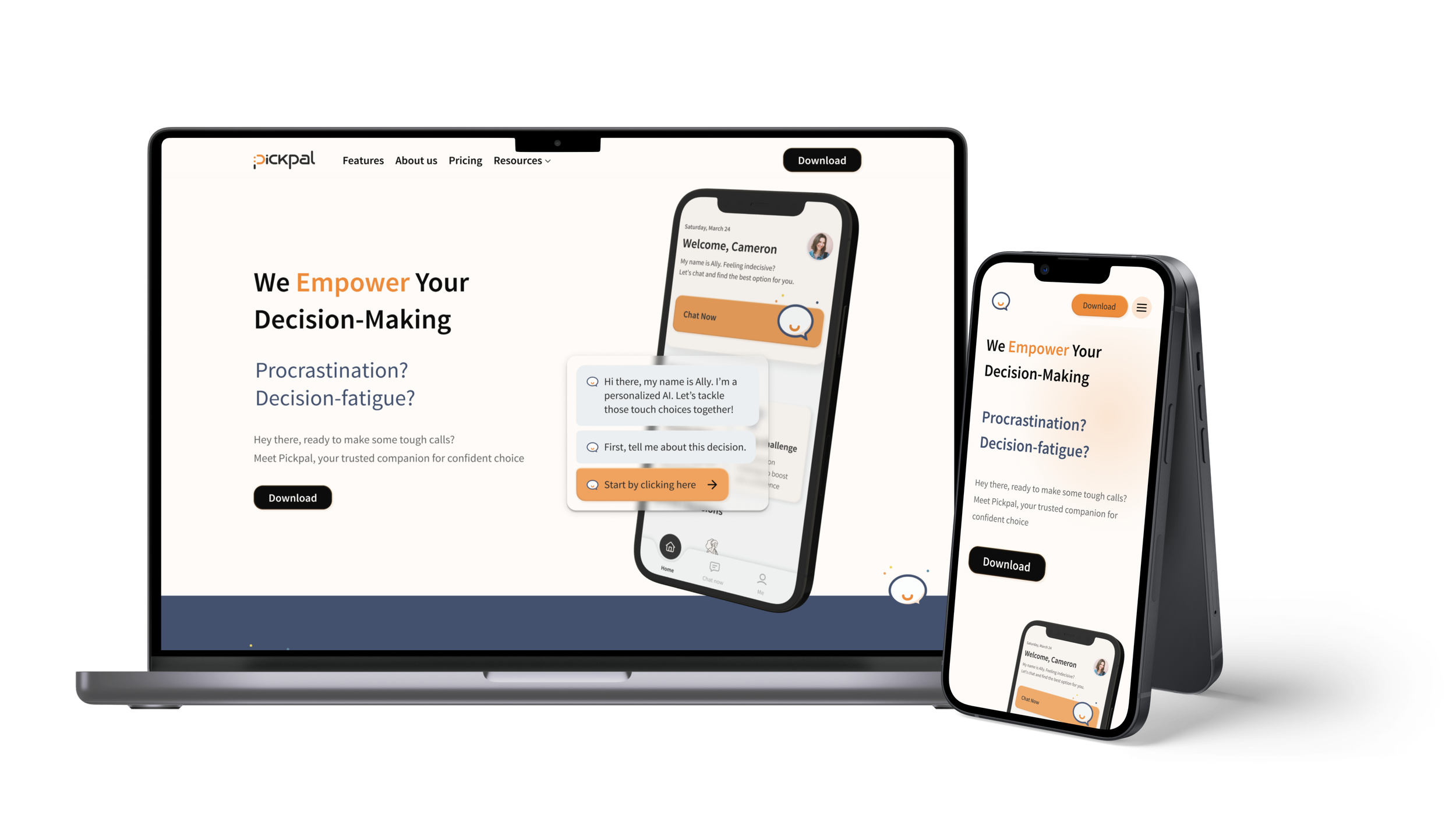
Marketing website
The purpose of a marketing website is to promote our brand identity, attract potential customers, and ultimately drive sales.
Therefore, I want to keep the marketing website not only aligns well with the feel of the application, but also visually pleasing and friendly to our potential customer.
Next steps
Taking this product to the next level, I want to make sure…
Improve data visualization feature
By conducting more in-depth research, and refining and interesting the design, I wish to take the data visualization feature to the next level by providing more detailed benefit comparison, and eventually adding in more techniques. To do so may involve more usability testing, A/B testing, etc.
Develop secondary task flow
The secondary task flow involves a notification function that will eventually keep reminding users (the persona, Cameron) that she has just make a decision through PickPal, and encourage the user to keep pushing through the decision-making process in real life. Further, allows users to update their final decision on PickPal.